My Media Studies blog
Monday 16 December 2013
Filming
Thursday last week I got out to film some more of the short film and took some pictures to use for my poster. I've had trouble organizing the sequence in the film that takes place in the character's home due to the props I need, a radio and western posters etc. However, I do hope to get that filmed this week so I can get on with the editing, which has been slowed down, because I haven't finished filming.
Monday 2 December 2013
Poster Update and FLAT PLANS
Ive played around with the images I have and have a mock up of the poster. This isn't final as I am not using images from the short film, or taken proper images for the poster. These are from my location scouting posts, but my short will include similar images that I will use. I have marked on rough placements of the different parts of the poster. I like the green colour palette and the two halves of the poster: the real world and the fantasy and I think this style lends itself to my short film.


FLAT PLANS
Here are my current drawn flat plans for both my magazine and poster with two variants of each.
Current Edit Questionnaire
I'm going to show the short film to a few people and get them to fill out the short questionnaire I created in response to the current rough cut of the duel.
Wednesday 27 November 2013
New Version of the Script
With the duel completely filmed, I had to organize filming the beginning and the end; the main character is in the 'real' world before he gets lost in his fantasy and returns to reality afterwards. However, after going through the end with my teacher, the weakness of the ending became evident and it wasn't an ending that really worked. I couldn't explain why it was a western and what the point of it was, so upon discussing this with one of my other teachers, we came up with a new ending, which changes my perspective of the protagonist and the story as a whole. Now it ends with the relevation that Simon has actually killed people, his isolation and obssession with westerns has led him to commit murder, but it is through his eyes we see it - the 'fantasy' western duel. Providing us with a twist and giving the duel more depth, I think this version of the script is a lot stronger and gives us more of a character for Simon and a sinister twist that is also genre defying and intriguing.
With this new script, I'm going to enter the shooting with a lot more in mind for Simon's motivation and feelings. I have some changes to make as well, so this script will go through a few more drafts, before I shoot.
CLICK HERE:
With this new script, I'm going to enter the shooting with a lot more in mind for Simon's motivation and feelings. I have some changes to make as well, so this script will go through a few more drafts, before I shoot.
CLICK HERE:
Monday 18 November 2013
The Good, the Bad and the Ugly - The Trio BREAKDOWN
An incredibly insightful video into the power and complexity of editing and cinematography in this shot by shot break down of the amazing standoff in the end of 'GBU', the scene that inspired my short film. Very indepth and informative.
The Art of Editing in The Good, the Bad, and the Ugly from Max Tohline on Vimeo.
UPDATE:
I have had trouble with this video and have had to relink it from another source, which is what is above. It may not be accessible at the time of marking.
The Art of Editing in The Good, the Bad, and the Ugly from Max Tohline on Vimeo.
UPDATE:
I have had trouble with this video and have had to relink it from another source, which is what is above. It may not be accessible at the time of marking.
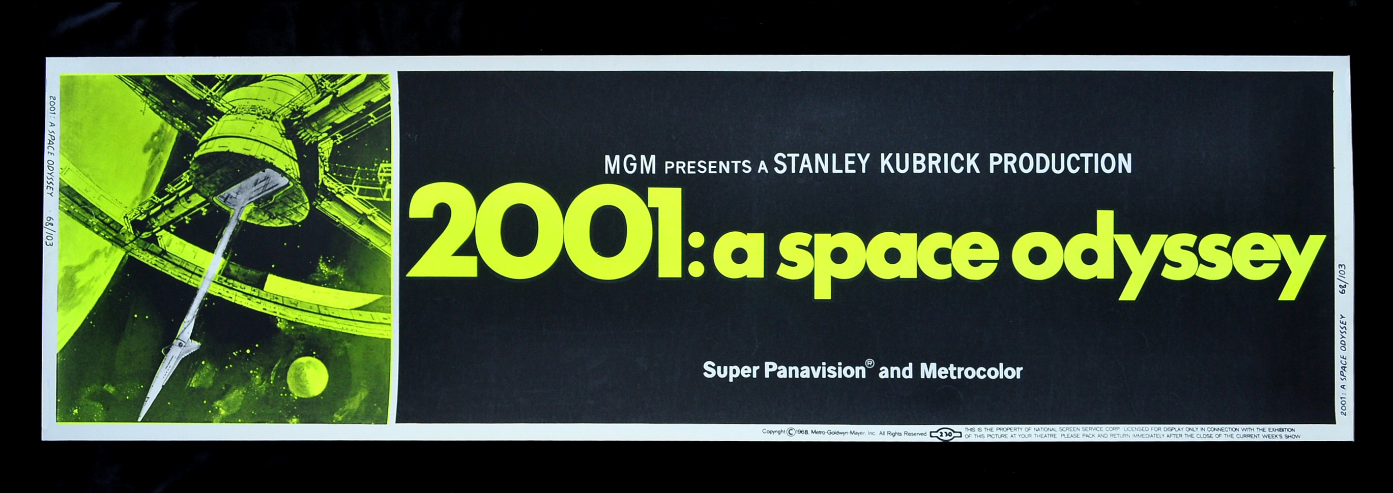
Anciliary Task - Poster
I really like this style of poster and I think I can tie it in nicely with the research I've done into Western posters already.


First Cut of Duel - Questionnaire.
Looking for audience feedback, I have prepared a questionnaire for people to fill in when they have viewed it in order to get an idea of what people think of it.
The video you will see is an early cut of the duel scene
from my short film. It still needs audio work, a soundtrack and the footage
needs to be graded.
Please take a moment to answer these questions as best as
you can. Most are questions that can be answered by using numbers 1 – 10 and
all feedback will be reviewed and used to improve the final cut.
Thank you for your time.
|
Question
|
Answer using numbers 1 – 10
(1 being lowest value and 10 the highest)
|
|
How much do you understand the story?
|
|
|
How much did you enjoy it?
|
|
|
How would you rate the story?
|
|
|
How would you rate the acting?
|
|
|
How would you rate the cinematography?
|
|
|
Any additional comments?
|
|
|
What changes would you suggest?
|
|
Monday 11 November 2013
First Stages of editing
I'm assembling the footage into a first rough edit of the short, beginning with what I have filmed of the duel. At the moment it lacks music, sound effects and grading. Some of the cuts need to be neater and I need to sort out the audio track so that it doesn't have me speaking over the top.
I'm thinking 'Trio' from "The Good, the Bad and the Ugly" soundtrack will work better though and I'm looking into getting permission to use that instead! I'm also going to create a questionnaire to get feedback on the current stage of the edit so I know if I'm going in the right direction.
I'm thinking 'Trio' from "The Good, the Bad and the Ugly" soundtrack will work better though and I'm looking into getting permission to use that instead! I'm also going to create a questionnaire to get feedback on the current stage of the edit so I know if I'm going in the right direction.
Short Script Analysis
I wrote some points down about my script and how I feel about it. I will go more in depth with it with a audio post on Kizoa at another point.


Monday 4 November 2013

Sunday 3 November 2013
Wednesday 23 October 2013
Editing
Today I hope to get some editing done. I only want a basic cut of it so that I can get an idea of what it looks and feels like, while also highlighting certain shots that I'll need to reshoot this sunday. I have a couple of things that I plan to put up on the blog. Second part of the pitch talking about my idea using screenr, aa podcast talking about the shoot on Sunday, a look at magazine reviews for my ancilliary task and possibly a prezi on the different aspects of the shoot I had to take care of.
Update: I'm unable to do any editing today, but I have planned to do something new. I will use Kizoa to evaluate my script!
Update: I'm unable to do any editing today, but I have planned to do something new. I will use Kizoa to evaluate my script!
Monday 21 October 2013
Sunday
Yesterday I went out and shot the duel scene, everything went smoothly with things seeming a bit rushed towards the end, because we were all getting tired. I'll talk at greater length about this in a podcast later this week. I have to go back and reshoot some shots, because I am not satisfied with the quality of some of them! Again, I'll talk about this in more depth in a podcast.
Wednesday 16 October 2013
Monday 14 October 2013
Wednesday 9 October 2013
Shotlist
SHOT LIST
Scene 1 INT HOUSE
CU – Eyes
CU – Table and Bag
MS – TV
MS – Simon Sitting
MS - Table
WS – Simon at Table.
WS – Simon through window.
Storyboard
These are photocopies of my storyboards. They are quick visual representations of the story so I can get an idea of what shots I want to use how I want to put them together. A lot of what is down can be understood from my point of view, which couldn't from someone elses. On a proper film production the director would create storyboards that he and the Director of Photography would both fully understand. Since I'm in both of those roles, I have decided to make them personalised so they're a quick reference point for me when I'm shooting, as other people don't have to fully understand them.

Monday 7 October 2013
The Pitch Part One
Part one of the pitch. When I go through the second part, hopefully I can take it more slowly!
SHOTLIST
Today, I went through my storyboards and picked out all of the individual and unique shots that appeared. I wrote them all down in a large shotlist for each scene.
I did this, because the storyboard shows me the sequencing of the shots that I imagine in my head. However, this sequencing is subject to change when it comes to the editing process. While it is helpful in creating the tone and pacing in my head, it doesn't give me an idea of all the individual angles I need to shoot, as the storyboard reuses some.
The shot list is a comprehensive list of ALL of the shots I plan to shoot while on location, not in chronological order, but in order of size, so I can wrap my head around what order to shoot them in while filming. A lot of the shots involve leaving the camera to play throughout the action, whereas some of them are very specific and are only filming a few seconds of footage.
Overall, this leaves me with a lot of editing options and a lot of footage to sort through in the final editing stages. Leaving the camera running throughout gives me more creative control over the final product. If I stuck religiously to the storyboard I would only film the action that was within each shot in the storyboard. This would leave me with no options when it comes to editing, because I would have only shot the action so that it would only link together the way I storyboarded it.
As I said, with the shot list, I can set up the camera to film the entirety of the action, rather than what is shown on the storyboard, and check off each shot as I go along. Although it does mean I have a lot of footage, which will take a longer time to edit, it means that if I feel that I'd rather use a wide shot at one particular time rather than the close up, I can do that without worrying about whether I had actually shot the wide angle.
Soon, I will also upload my storyboards and might also upload shotlist, but I might not, as it's a long boring list of shots with nothing interesting on it!
Test Footage
The weather hasn't been great, meaning the day I was originally going to film the introduction sequence on was cancelled. I did get time yesterday, but the actor had arranged a hair cut for today. This meant their be noticeable conflicts in continuity between scenes. Instead of taking the day off, we went out and shot test footage, so I could see if what I was going for looked good. I'll edit it together and upload it soon! I also have another video having a better look at the costumes in the works.
Sunday 29 September 2013
Wednesday 25 September 2013
Monday 23 September 2013
Thursday 19 September 2013
Location Scouting Part II


Potential Establishing Shots
I like the idea of having a shot of the city from a distance as an establishing shot, giving the short a location. However I'm not sure if its necessary or will add anything to the piece. When I get to filming I will get the footage just in case.
CLICK TO CONTINUE
|
Monday 16 September 2013
Research and Planning - Music
There is a piece of music that I really like that I think would suit the short film's duel. Its quite a modern track, but I think it fits in with the way I'm approaching the short, with it being the imagination of a young adult. I contacted the artist's agent about how I would aquire the rights to use the song since it will be uploaded onto Youtube.


The Good, the Bad and the Ugly - "Duel"
A source of a lot of inspiration in terms of the direction of my short film. I'll about this at greater length in a podcast later this week.
UPDATE:
The original video was taking down because of Copyright. NOTE - This new link may not be accessible at the time of marking.
UPDATE:
The original video was taking down because of Copyright. NOTE - This new link may not be accessible at the time of marking.
Saturday 14 September 2013
Location Scouting


I went out location scouting with my friends and took some pictures of the different places I came across. These first two areas are pretty nice and are very close to each other, the problem being that there isn't much flat land and its mostly all hill, with the skyline being dominated by the surrounding town and industrial areas. For the standoff sequence I think the area should be more open and be flatter. I know I can't find an area that looks pure western, so I'll have to find a local area that creates the same tone. (i.e open, spacious, flat
land)
Click to continue
¦
Wednesday 11 September 2013
Update: Location Scouting
After school today I'm going out with some friends (who will be helping out with the short film) to scout locations for the short film. I'll have to consider creative and practical aspects of each place to figure out how suitable it is. I'll be bringing my camera to snap some pictures of each location and to test out some of the blocking and camera placement for the short.
Monday 9 September 2013
George Lucas in Love
George Lucas in Love is a short film parodying the conception of Star Wars. It follows George Lucas, a university student with writer's block, as he travels around campus going about his daily life. Everything he encounters parodies and references Star Wars in one way or another, creating a humorous story that is easy to follow.
The short has a pretty simple premise, but it has a flawless execution. Despite not having much going for it in terms of cinematography, the direction and writing are great and drive it to success. The production design is successful in emulating the different aspects of Star Wars and it works along with the sound design to create humour.
With something like this, the Production and Sound Design, and writing are the aspects I need to pay attention to if I want to be successful with my own short. Although I don't want to create something of a similar tone, it can still be a film that I can learn from.
Doodlebug
Doodlebug is a short psychological thriller written and directed by Christopher Nolan.
The film has a very simple story, but it is very effective. The production design is very immersive, drawing the audience into a very surreal world. It lacks a traditional narrative, but the story raises questions and is entertaining and peculiar.
The lack of a traditional structure is something I want to take note of, especially since this short lacks dialogue and manages to create meaning purely through visuals. Although my short will feature dialogue, I can learn a lesson from this successful short film.
Short Film Analysis
I'm going to look up some more short films, ones that weren't done by previous students, and analyse them so I can prepare for my short film.
Thursday 5 September 2013
Screenwriting
Update:
I accidently managed to delete this Prezi and there's no way I can get it back, because of the way Prezi works. I'm going to try and make a new one to replace, but because of the amount of work that went into the original, it might be a while before I get a new screenwriting one out.
Tuesday 3 September 2013
Update
At the moment I'm making a Prezi about the script I'm writing for the Short Film. It'll only be a short one about the different aspects of a script and why I decided to do some of the things I've done.
Sunday 1 September 2013
Thoughts and Concepts!
Next time I want to go through the writing process, but I'm going to use Prezi next time! :)
Saturday 17 August 2013
Thursday 8 August 2013
It has been a while!
Hello! Quick update.
I've been pretty busy for the past few weeks and I haven't had any real opportunities to work out what I'm doing with my short film D:
I also happen to be going away on Saturday as well, but I will bring a notebook with me and i'm just making sure to figure out as much stuff as I can. I want to make a video update explaining what ideas I come up with as well and I'll do that as soon as I have time when I get back. My holidays are busy!
Anyway, things seem like they can go well, its just I haven't got a lot of room in my current schedule to do anything massively useful. But fingers crossed I get to work everything out!
Monday 15 July 2013
Thoughts!
I've again been thinking about ideas for my practical project. I think, due to the school audience and context as a piece of A2 coursework, I might stay further away from the slasher horror/gore filled short film. I'm unsure on whether or not it would work for two reasons.
I've been told by many people on the internet to "cast teenagers as teenagers". Don't make them out to be something that they're not. They're not 65 drug lords and their also not murdering psycopaths. I'm probably going to have to figure something else out.
As an abstract short film I want it to revolve around a theme, something that the visuals can represent and something the audience can understand and connect with. I believe that themes like isolation or happiness will suit it well. Although the film hasn't been released yet, I think that in Only God Forgives the director uses corridors to represent the character's inability to pursue their hopes, even though they can see it stretched out before them. That sort of thought is what I want to include in my short film! I will post sometime later this week with more solid ideas.
- Can I realistically portray violence and gore on a pratical and academic level? Will the exam board allow me to and if I did, could I even pull it off?
- Can my actors be taken seriously?
I've been told by many people on the internet to "cast teenagers as teenagers". Don't make them out to be something that they're not. They're not 65 drug lords and their also not murdering psycopaths. I'm probably going to have to figure something else out.
As an abstract short film I want it to revolve around a theme, something that the visuals can represent and something the audience can understand and connect with. I believe that themes like isolation or happiness will suit it well. Although the film hasn't been released yet, I think that in Only God Forgives the director uses corridors to represent the character's inability to pursue their hopes, even though they can see it stretched out before them. That sort of thought is what I want to include in my short film! I will post sometime later this week with more solid ideas.
Thursday 11 July 2013
Monday 8 July 2013
Short Film Example
This is an example of a really successful short film with a very simple premise. I love the execution and think its a great piece of work.
Friday 5 July 2013
Short Film Ideas
I'm currently brainstorming ideas for my A2 short film. I've been thinking for a while for what to do, having written some ideas already for narratives that heavily feature dialogue, but I would rather do something more abstract. The short five minute format is best suited for abstract short films that are visually striking and force the audience to draw their own conclusions. I've tried writing a short film already for the practical, but I feel that the quality might be effected by the short length, whereas in an abstract short film I can focus on creating interest solely from the cinematography.
I recently watched Stanley Kubrik's A Clockwork Orange again and while brainstorming I feel slightly inspired by the visuals and the character from the film. I think I would like to make a psychological thriller/horror short featuring a character with an interest in violence. The cinematography would represent the narrative, which is a direct representation of the sinister complexity of his thoughts and brain. I obviously have to speak to my teacher about how far I'm allowed to actually go with it, but I think it would be great and interesting to be able to play around with lighting and editing to create a horrifying yet interesting short.
I also want to take inspiration from the directing style of Nicolas Winding Refn. He is my favourite director and creates some of the most visually impressive films I've seen, Drive is my personal favourite. His use of high contrast and saturation, as well as lighting, always produces a beautiful product. I think I want to try and replicate his style of cinematography in a homage way, not a copying way.

Drive, directed by Nicolas Winding Refn
I recently watched Stanley Kubrik's A Clockwork Orange again and while brainstorming I feel slightly inspired by the visuals and the character from the film. I think I would like to make a psychological thriller/horror short featuring a character with an interest in violence. The cinematography would represent the narrative, which is a direct representation of the sinister complexity of his thoughts and brain. I obviously have to speak to my teacher about how far I'm allowed to actually go with it, but I think it would be great and interesting to be able to play around with lighting and editing to create a horrifying yet interesting short.
I also want to take inspiration from the directing style of Nicolas Winding Refn. He is my favourite director and creates some of the most visually impressive films I've seen, Drive is my personal favourite. His use of high contrast and saturation, as well as lighting, always produces a beautiful product. I think I want to try and replicate his style of cinematography in a homage way, not a copying way.
Drive, directed by Nicolas Winding Refn
Wednesday 3 July 2013
Monday 1 July 2013
Tuesday 18 June 2013
Chase Sequence 2!
Soon I will upload a 'directors commentary' style voice over going through what we did :)
Monday 17 June 2013
Effects


This is my audio set up. I had to make the two seperate songs fade into one another, because otherwise it felt too sudden and forced when they placed normally. So I blended them together, creating a more fluid and natural flow between the two songs.
Colour Correction


The first image is a frame from the original video and the second one is a frame from the colour graded video. As you can see the the colours in the second image are different, although it is subtle, it looks grittier and more cinematic. To achieve this I alter the black and white levels slightly. Making the dark ares blacker and the light areas whiter then bringing the saturation down to takes some of the life out of the image. Then I shifted the white point to blue to give the overall image a slight blue shift, subtle but effective. Because we only got to use natural lighting, we couldn't alter the look of the image that effectively since we didn't have any control over the lighting while filming.
Thursday 13 June 2013
Editing, Post Production and General Thoughts
Post production has to be my least favourite part of film making. Well, it isn't actually that bad, but I find that the tediousness of the process shows through more than it does when on set and filming, because you're sitting there doing the same thing over and over again rather than moving about and doing different tedious tasks while filming.
That being said, despite the bore of fine tuning clips and colour grading every individual section of the sequence, I'm having fun. That's only because the chase itself is funny. Due to an excellent choice by Kaan, we have a song that makes everybody who has seen it laugh.
It's a short and simple chase sequence that doesn't really have any meaning so in terms on cinematography or mise en scene we haven't really achieved much to be honest. It's action and so the shots and editing are used to accommodate the humorous tone. If we had went for something more suspenseful or tense, we would have used the camera to actually do something with that. But, as it is, its a short and funny chase with only minor camera or mise en scene points that actually stand out.
I'm using iMovie to edit the film and it's both a blessing and a curse. It simple, accessible and does most of the things I want and need it to do, but at the same time, it is what it is: a free piece of editing software that has the basics and nothing more. The control over the colours, clips and sound are limited, but its instant playback is extremely helpful. I have a feeling that for my final project, it will be a mix of iMovie and Adobe Premiere for editing, as I feel more comfortable with Premiere and it can do a lot more.
As it is, the chase is sort of finished. I've edited all of the footage into sequence and moved things around so it all makes sense. iMovie also has a nifty feature that lets me change the colour balance and make it look more suiting. I'll do a later update on this to show the effects and upload pictures of before and after.
The last thing that remains is one song and some tweaking of audio. The song featured in the last part is in place, but I still need to put in the song that is featured during the actual chasing and one that conveys the tone we're trying to achieve, which is humour. Kaan, of course, is in charge of finding and choosing that music, because I don't know the difference between Lil Wayne and Little Mix...
However, I also have to edit the audio of the clips, but I'm unsure as to whether or not to keep the background sound or to have it solely soundtrack. I'll have to decide this tomorrow, when'll hopefully I've finished editing the video! :)
Tuesday 11 June 2013
Preliminary: Second Chase
On Monday our media class split into two groups in order to go off and create our own chase sequences. In my group there was Kaan, Ryan and me.
To start off with we scouted around the school for locations, while brainstorming potential ideas. We found as suitable place to film that suited our short narrative and went and found some 'actors'. One of our friends who had a free lesson ended up helping us out, while me and Kaan opted to fill in the two other roles.
We all worked together on the camera, calling shots, suggesting alternatives and working the equipment. We filmed it in less than an hour, returned to the classroom when the battery ran out then went back out to do some additional photography, getting shots we didn't manage to begin with and thinking of new ways to make it interesting.
We also had access to a range of equipment. Since it was a chase we didn't really need any sound equipment such as a microphone or a boom; the plan was to overlay music to create the atmosphere anyway. However, we did make use of the tripod and the small handheld steadicam that was available. The tripod was useful for creating static shots and using a variety of angles. Although the steadicam was helpful in that it was point and shoot rather than a painstakingly long tripod set up, meaning we could think of a shot and shoot it straight away. The steadicam did have its limitations though, it wasn't perfectly helpful when we decided to run with it and the nature of the equipment meant we couldn't shoot at any angles such as from below or from above.
Tomorrow the idea is to edit it, which we will do on the Macs on iMovie. I'm going to suggest to my group that I take the footage home and colour correct it on my computer at home on Adobe premier to make the footage look a lot less bland. I haven't used colour correction or colour grading before, but I would love to use it for my final product to create a cinematic quality that will set it apart from other products. I have began to conceptualize the moving image that I want to make and I hope to make use of all the equipment available and go big!
Wednesday 5 June 2013
To The Max
This is the completed chase sequence. There's a lot I like about it, but there's a lot I'd change as well, later on I'll upload a post looking back on it!
Thursday 23 May 2013
Post Production
As a sort of preliminary to next years moving image practical, i wrote and directed a short that im currently editing. Its in the style of a chase, like last years sixth form did, but i tried to put a twist on it. Ill try and get it uploaded sometime next week.
Heres a not so flattering screenshot:

Monday 13 May 2013


Callum's Media Blog: Preliminary Work REPOST
Callum's Media Blog: Preliminary Work: As a preliminary task, we created a magazine front cover and contents page. We will use these to prepare for our final practical project, i...
Thursday 9 May 2013
Wednesday 8 May 2013
Questionnaire Answers - open (eval prep)
These are a few selected answers from different people in my open questionnaire (the age and gender statistics were around the same as the open)
2) Would you consider buying it if it were on sale? Explain why?
Yeah, it has a really affordable price.
The price is reasonable and I think I would buy it if it were on sale. It looks real.
Feature Article: I normally flip to the feature article when browsing, and this one really catches my attention
I thought the layout was suiting and felt it added to the magazines quality.
6) What is your opinion on the colour scheme?
7) What is your opinion on the fonts?
The fonts were interesting. they worked well.
8) Would you recommend it to others? Explain why.
More engaging content.
____________________________________________________________________________________
The closed questionnaire is somewhat more helpful than an open: I can get a real sense of the OPINION of my audience, but I can't add it up and turn it into meaningful statistics. I'm going to make powerpoint drawing together the results to show how I drew in, attracted and addressed my audience! :) I hope to post that tomorrow or tonight if it turns out well.
1) What did you think about the magazine? Explain
why.
I think its great, it really looks
authentic!
Looks good, like the way its set out
2) Would you consider buying it if it were on sale? Explain why?
Yeah, it has a really affordable price.
The price is reasonable and I think I would buy it if it were on sale. It looks real.
3) Which part did you prefer: Front
Cover, Contents or the Feature article? Explain why.
Front Cover: It’s the part that
attracts me the most to magazine, because it seems like its packed with contentFeature Article: I normally flip to the feature article when browsing, and this one really catches my attention
4) What is your opinion on the layout?
Its laid out really well, but I feel
that the contents is underdeveloped.I thought the layout was suiting and felt it added to the magazines quality.
5) What is your opinion on the
pictures?
Good quality pictures, they’d make me
buy the magazine.
Awesome. Think the contents ones are
pretty cool
6) What is your opinion on the colour scheme?
I liked the colour scheme. It
complimented the other features
It didn’t stand out, which I think is
good, because it worked but was subtle about it7) What is your opinion on the fonts?
The fonts were interesting. they worked well.
They looked original and
something I hadn’t seen before. Suited the genre.
8) Would you recommend it to others? Explain why.
I have friends that I would definitely
recommend this to, it looks like the type of music they’re into
Yeah, Indie Rock fans will like it.
9) Do you feel it is age appropriate?
Explain why.
The models look like they’re my age, so
I think it would appeal to our age group.
Doesn’t seem like its for older people,
just suits our age group
10) Which parts do you feel are the
MOST effective? Explain why.
I think the colours are the most
effective. They fit the style of the magazine without getting in the way of
whats important.
The layout. It screams Indy Rock.
Loved the arrangement.
Colours were most effective, they
looked nice and thought they were just right
11) Which parts do you feel are the
LEAST effective? Explain why.
At points I thought the fonts were
undeveloped and didn’t work effectively.
The actual content of the magazine could have
been a bit better, didn’t always read as authentic.
None! I thought it all worked really
well.
12) Any General comments/ improvements?
Fonts need some work.More engaging content.
____________________________________________________________________________________
The closed questionnaire is somewhat more helpful than an open: I can get a real sense of the OPINION of my audience, but I can't add it up and turn it into meaningful statistics. I'm going to make powerpoint drawing together the results to show how I drew in, attracted and addressed my audience! :) I hope to post that tomorrow or tonight if it turns out well.
Questionnaire Results (Evaluation prep)
Here are the results of my open questionnaire. I handed it out to 20 people who were part of my target audience and got them to answers the questions based on their views on my magazine. I will post the results of the closed questionnaire (which I gave 20 other people) to show a few of the answers that were given.
|
Questions
|
Answer
(please circle)
|
|
Age
|
15 3) 16 4) 17 4) 18 3) 19 2) 20 2) 21 2)
|
|
Gender
|
Male 16)
Female 4)
|
|
Do you like the magazine?
|
Yes 15)
No 1) Not Sure 4)
|
|
Would you buy it if it were on sale?
|
Yes 16)
No 1) Not Sure 3)
|
|
What was your favourite section
|
Front cover 5) Contents 4)
Feature Article 1 5) Feature Article 2 6)
|
|
Did you feel that it effectively represented the
Indie Rock Genre
|
Yes 18)
No 1) Not Sure 1)
|
|
Did you like the photos?
|
Yes 16) No 3) Not Sure 1)
|
|
Did you like the colours?
|
Yes 17) No 1) Not Sure 2)
|
|
Did you like the fonts?
|
Yes 15) No
3) Not Sure 2)
|
|
Would you recommend this magazine to a friend?
|
Yes 17) No 3) Not Sure
|
|
Do you feel that it is appropriate for your age
range
|
Yes 18)
No Not Sure 2)
|
|
What part of the magazine did you feel was the most effective?
|
Colours 12)
Fonts
Content 1)
Pictures 1)
Layout 6)
|
|
Which part of the magazine did you feel was the least effective?
|
Colours 2)
Fonts 8)
Content 4)
Pictures 4)
Layout 2)
|
Subscribe to:
Posts (Atom)